


TYPOGRAPHY — the art of organizing letterforms and text that makes words legible, clear, and visually appealing — is more than just words on a page. It’s in every aspect of our lives: on our phone screens, in logos on product packaging, and on highway signs which need to be readable quickly while you’re moving at high speeds. Typography embodies not just styles and functions but emotions, intentions, and identities.
One of the biggest (and most fun) challenges in typography: designing a wordmark. (Wordmark is just the technical term for a logo that only uses typography; other logos may also use symbols, shapes, other graphic elements, or some combination of these). Designing a typographic wordmark that effectively encapsulates approximately 5,000 years of Jewish thought is a uniquely Jewish challenge. As a people, we are constantly exploring and balancing our deep historical roots with contemporary relevance.
How can typography— a tool of expression and purpose, yes, but one that is limited to geometric shapes and their arrangement on a page — convey such a rich history, while also operating in a modern context? How can you channel that history without being stuck in the past?
Not all design missions begin with extensive historical research but, in this case, some was clearly called for. Given Scribe Quarterly’s name, would knowing more about scribes’ work and their role in creating ancient Hebrew script inform the new logo’s tone and flavour?
The scribes of ancient Israel were a tiny literate minority in an overwhelmingly illiterate and oral-based culture. These Jewish scribes were primarily responsible for copying and preserving the Hebrew scriptures, acting as experts on Jewish law by studying and interpreting the Torah, and essentially serving as the legal and religious record keepers of their time. They were considered masters of Hebrew writing and were crucial in transmitting the Jewish tradition through written texts. Their main objective was to teach the Torah to the Jewish masses, and Jewish youth in particular. Ancient Israelite scribes also shared their ideas and language traditions with people from neighbouring cultures.
In the fifth or fourth century BCE, after the Jews returned from exile in Babylon, Ezra — a direct descendant of Aaron and known skilled scribe — is believed to have played a key role in gathering and standardizing the existing Torah scrolls, ensuring their proper transmission. You might say that Ezra was one of the first editors, essentially hiring scribes to write down and revise what had been, until that point, an oral tradition.
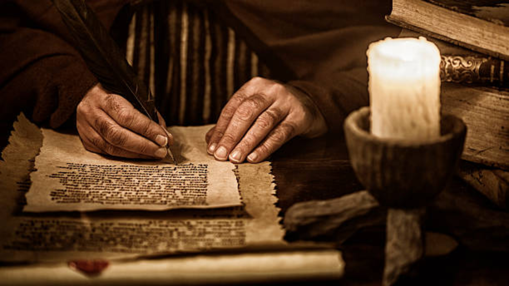

If ancient scribes were akin to our modern-day editors, perhaps studying the evolution of ancient scribal Hebrew could lead me to an appropriate choice of a modern typeface to serve as the basis of Scribe Quarterly’s logo. (You may be wondering why I am using the word typeface instead of the term you’ve likely heard much more often: font. A typeface is an overarching design or style of lettering while the word font refers to the specific variations with a typeface. For example, Arial is a typeface, and Arial Bold is a font.) I immediately began delving into examples of scripts used by ancient Hebrew scribes for Torah scrolls, and drawing visual connections to their modern digital counterparts.
The story of Jewish writing is an incredible journey through time and place. Hebrew script has dramatically changed over thousands of years, influenced by culture, religion, and technology. Hebrew script originates from the ancient Semitic alphabet which dates to about 1700 BCE. By the eighth century BCE, Aramaic, a branch of the Semitic script, was using modified versions of the original letterforms. Scrolls created between the third century BCE and the first century CE show a clear evolution of that scribal tradition. Many of the contemporary basic features of the Hebrew script are already present in these scrolls, and the text can be deciphered and read by almost any present-day Hebrew reader.
The ninth century saw the dawn of a new era of the so-called ‘Oriental’ script. This script was developed in the Levant, Egypt, and Babylon. It is well-documented in the manuscripts found in the Cairo Geniza (a storehouse that contained many thousands of Jewish manuscripts and fragments of writing). These manuscripts introduced letterforms by scribal artists. They were refined, homogeneous, and balanced. Horizontal stresses emerged for the first time.
The dense, embroidery-like texture of these Hebraic texts showcased narrow letterforms and extremely narrow spaces between words.
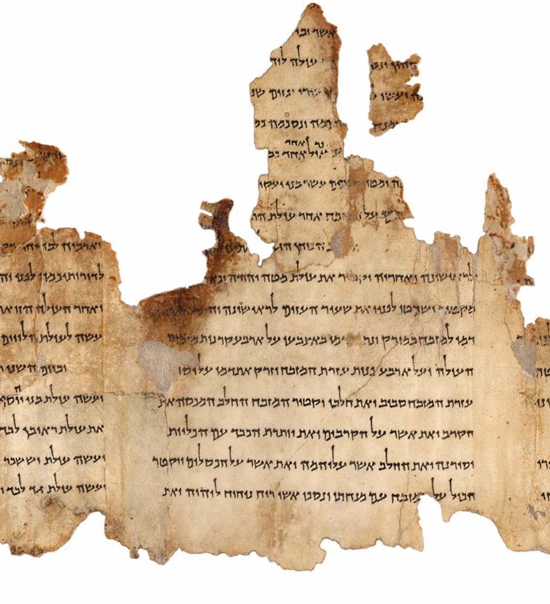
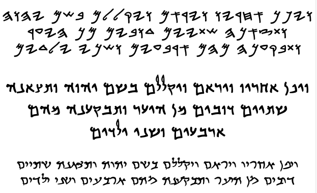

The Middle Ages brought two main influential Hebrew script styles: the Ashkenazic and the Sephardic. Both evolved from the Oriental script and are similar to today’s ‘square’ text faces. The Hebrew Ashkenazic style developed in Germany and Northeastern France from the thirteenth to fifteenth centuries. Jewish scribes used the quill as their writing tool and were influenced by Gothic Latin. The script featured extreme contrasts between thicks and thins (the contrast between width of the strokes that make up a letterform), heavy downward strokes, and lighter horizontal strokes. The Sephardic style was developed and used in the Iberian Peninsula for three hundred years until the expulsion of Spanish Jewry at the end of the fifteenth century. This manuscript style was less frilly than its Ashkenazic counterpart, narrower, and reduced to the letter’s essential parts. Sephardic Jewish scribes’ use of a pointed reed, popular among scribes of the region, created lettersforms with less contrasting thicks and thins. Lastly, the Sephardic style showed some reminiscence of Arabic calligraphy with its typical flowing rounded curves.
Within both of these scripts, three styles emerged: a formal ‘square’ letter used in book styles; a cursive, flowing style for correspondence and everyday use; and a rabbinical script (Rashi script) for religious commentary.
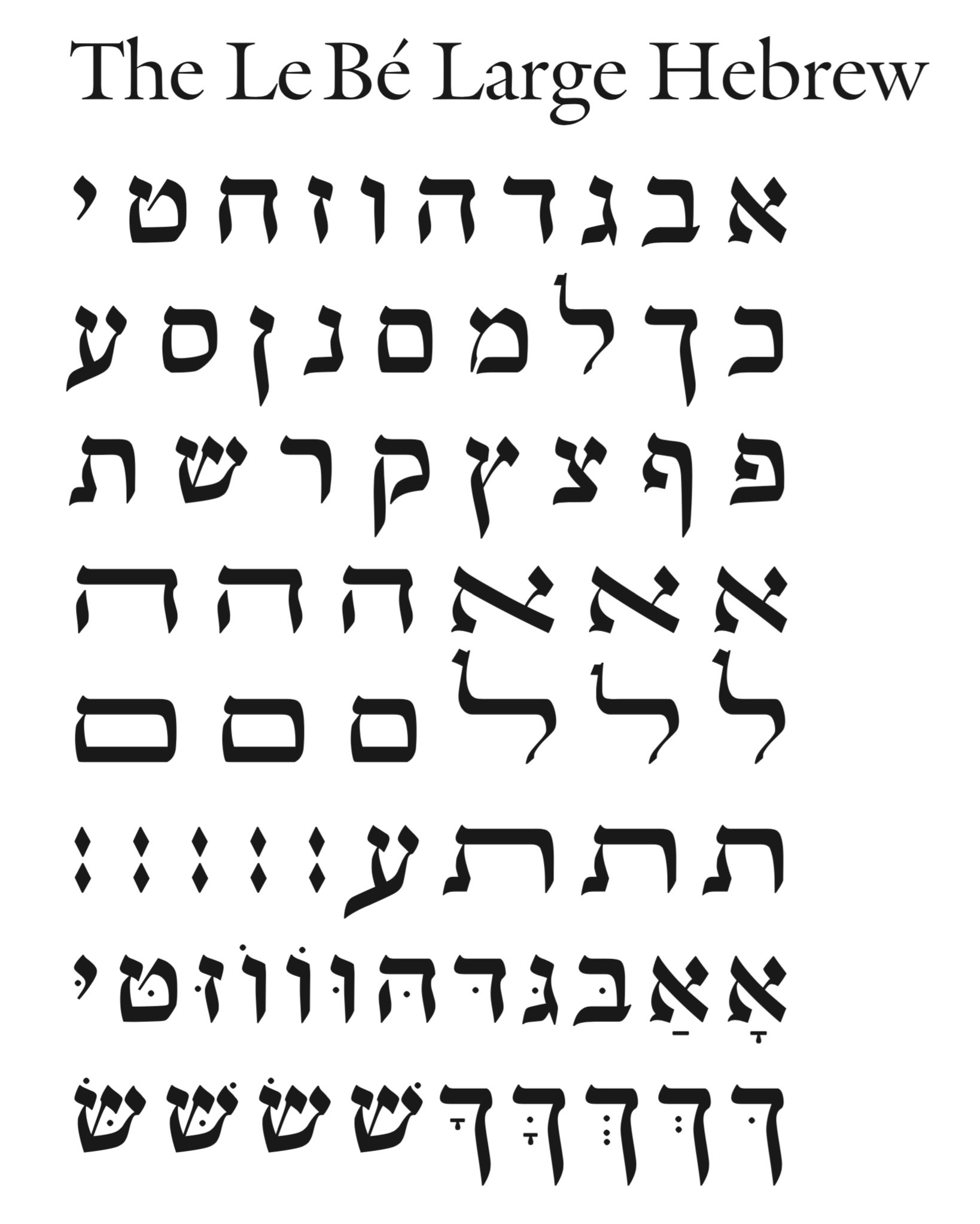
The first Hebrew books were printed in Italy in 1475 by immigrants from Germany and France, using typefaces based on the Ashkenazi style. In 1559, Guillaume Le Bé, a skilled craftsman working in France and Venice, became interested in Hebrew script and began manually carving its letter shapes into steel punches, part of the process of making movable letters for printing. He collected script samples and cut 19 Hebrew square and cursive letterforms.
Neither Le Bé nor the printers who used his scripts were Jewish: The Most Serene Republic of Venice prohibited Jews from publishing books. (They weren’t printing them just on behalf of Jews, either; Hebrew texts were studied by many intellectuals and scholars.)


It was not until the first decade of the twentieth century that Hebrew script began to see significant changes in form. This was born out of a desire for more ‘secular’ and modern Hebrew typefaces during the rise of the Zionist movement at the end of the nineteenth century, and the revival of the Hebrew language. Jewish society was becoming less and less religious, and Hebrew was becoming a living language again. This meant that many more secular, everyday texts were being printed, and those called for earthly, secular typefaces — ones that were visually streamlined and shorn of the elaborateness of the lettering that might appear in a prayer book.
TYPEFACES roughly fall into four groups: serif, sans serif, script, and display. Each has a specific use. Serif typefaces, for example, are used for their legibility: the small projections that appear on the strokes of the letters can help guide a reader’s eye along the lines of text, which is why serif typefaces are easier to read (and why most magazines and newspapers use them for the bulk of their articles). Different typefaces also evoke different sensibilities, which I refer to as a “tone and flavour”; for example, a sans serif offers a more modern look while a script conveys elegance. These categories are fundamental to a designer’s choice of the right typeface for a project.
Designing a wordmark involves far more than settling on a typeface: there are countless decisions about size, capitalization, kerning (the spacing between letters), and configuration. After mocking up dozens of options, narrowing down to a list of three, and much debate, we decided to start with a typeface called Tangerine for Scribe Quarterly’s logo. The typeface is monumental in proportion and somewhere between a sans serif and serif. Its thicks and thins are reminiscent of Le Bé’s Hebraic font.
Selecting it was just the beginning, however. Because the lowercase letterforms in Tangerine are quirky, I decided to set Scribe Quarterly in all caps — but setting both Scribe and Quarterly in all caps in the same size would have been akin to yelling, so I downplayed the word Quarterly by reducing its size and placing it to the right. Then, because not all the letterforms felt perfectly balanced to us, I worked with a typographer (someone who specializes in typeface design) to modify some of them — for instance, we widened out the R and adjusted the top “bowl” of the B to bring a greater sense of movement to the wordmark.

At the same time, I began adjusting the spacing between the individual letterforms. This is done by taking out or adding tiny amounts of space between each pair of letterforms until there is a visually pleasing and legible word. The goal is to ensure the spacing between the characters appears even and balanced to the human eye, especially where certain letters might appear too close together or too far apart. (Counterintuitively, simply using the exact same amount of space between all the letters does not achieve this effect.)
The wordmark you see on the cover of Scribe Quarterly may have taken its cue from Le Bé’s Hebraic typeface but it was the breakthrough of digital font master Matthew Carter and typographer Scott-Martin Kosofsky that taught me that historic research is a worthy pursuit. Their fresh digital “cut” of Le Bé’s typeface inspired me because of its clarity and swooping beauty. As Kosofsky wrote about designing their Le Bé font: “You don’t throw out your visual culture because you’re trying to reinvent yourself. We’re a people with a tradition — why should we lose it?”



